29B Glenvale Crescent Mulgrave 3170 info@cpcprint.com.au (03) 9501 0071

Support

Design Basics

What is trim, bleed and the “safe text zone”?

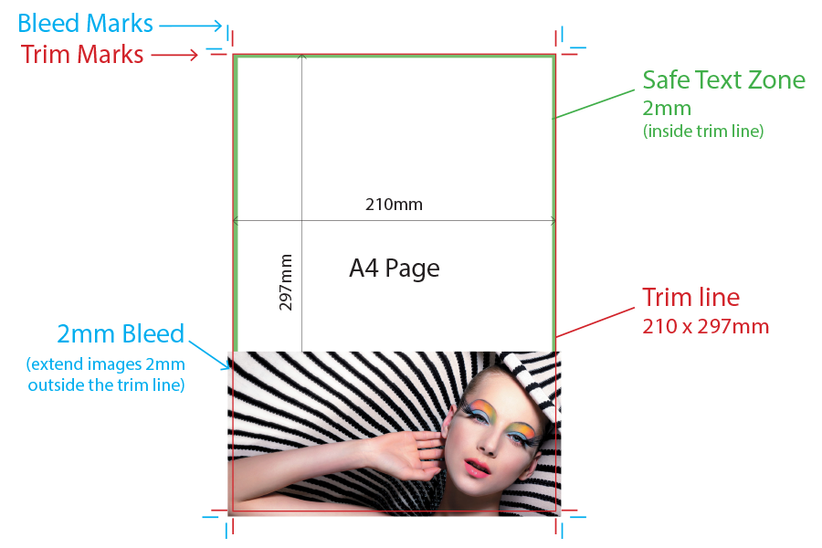
Trim is the border of your artwork specifying where it is to be cut. It defines the final size of the piece. Trim and Crop are interchangeable terms. Trim lines are represented by a vertical and horizontal hairlines marked on each corner of the page (see example below). In layout programs such as Adobe InDesign, when you export your artwork to PDF, a dialogue box asks if you want to include Crop and Bleed marks. Tick both of these then specify how much bleed, in this case 2mm.

Bleed is a printed area that extends beyond the trim. Allowing 2mm bleed guarantees that you won’t see a thin white line if the piece is cut a fraction to the left or right. It is basically and extra 2mm of artwork on all edges to safeguard against shifts when trimming. Layout programs give you the option to include Bleed Marks when exporting PDF’s so we ask that you include these, as well as Crop Marks.

The Safe Text Zone is a 2mm buffer zone within the trim line that ensures important text or graphics are not cut off when the document is trimmed down (see below). Our print registration and finishing equipment is extremely accurate however it is best practice to include 2mm bleed and 2mm safe text buffer.


Click to download a large PDF version of this image
Download

What is the difference between vector and bitmap images?

A bitmap or raster image (e.g. JPEG, PNG, GIF) is made up of thousands of tiny, set-size pixels. This means they cannot be enlarged without stretching the set-size pixels and blurring the image. The number of pixels within an image is the resolution. The more pixels within the image, the smoother and sharper it looks. If there are too few pixels in the image, it will look blocky and pixelated. Bitmap images need to be supplied at a minimum resolution of 300dpi (dots per inch).

Vector graphics (AI, EPS etc) use geometrical shapes such as lines, points, paths and shapes (which are all mathematical expressions) to create images. Each point has a defined where to buy best replica rolex watches position on the X and Y axis meaning the file information can be exported and scaled to any size without distortion. When text is converted to http://www.vapersoft.com outlines, it then goes from bitmap to vector and can be scaled to any size, remaining crisp and smooth. This is why we recommend outlining all text when supplying artwork.

Why do I need to supply my artwork in CMYK?

While computer screens and digital devices display colours in RGB format (Red, Green, Blue), the 4-colour printing process uses CMYK (Cyan, Magenta, Yellow and Black). The range of RGB colour combinations available to view on a screen is much greater than the range that can be printed on paper. As such, if artwork is supplied in RGB format, the printed result will look dull and with less contrast than you intended. We always recommend you preview your artwork in CMYK format, then adjust the colour palette as close to your intended output as possible.

Should I use 100% Black or Rich Black?

If your design has medium to large areas of solid black, we strongly recommend you use Rich Black to ensure a nice solid result. 100% black tends to wash out in comparison to other CMYK elements in the design.

A good mixture for Rich Black on heavier stock weights is: 50 / 50 / 50 / 100. For lighter stock weights use 30 / 0 / 0 / 100. It is also safe to use Rich Black for text above 7pt as our printing is high quality and registration is not an issue.
swiss-made luxury https://www.replicawatchesau.com/.

Standard Sizes

Standard Paper Sizes

Paper Size Dimensions (mm)
A1 841 x 594mm
A2 594 x 420mm
A3 420 x 297mm
A4 297 x 210mm
A5 210 x 148mm
A6 148 x 105mm
A7 105 x 74mm

Standard Envelope Sizes

Envelope Size Dimensions (mm)
DL 110 x 220mm
DLX 120 x 235mm
C3 458 x 324mm
C4 324 x 229mm
C5 229 x 162mm
C6 162 x 114mm
B4 353 x 250mm

Artwork Specifications

When your artwork is ready, before uploading we recommend you download our Print Ready Checklist. We only accept Adobe PDF files with the following attributes:

  • 300dpi resolution
  • 2mm bleed (5mm for booklets)
  • crop and bleed marks included
  • fonts outlined, text no smaller than 5pt
  • all colours converted to CMYK

We have a full range of templates available in a range of formats. The templates are set up to size, with bleed and trim lines, column guides, safe text zones and dielines where applicable.

Setting up artwork for:

Setting up artwork for Spot UV Varnish

Choose any Pantone colour from the Solid Coated colour books. In the Swatch Options dialogue box, change it to CMYK mode (leave it as Type: Spot Color) and rename it “Spot Varnish”. This colour will now denote areas to be covered with the Spot Varnish.

Return to your artwork and create a new layer called “Varnish”. Select all the elements from the original artwork layer that you want to cover in spot varnish. Copy & paste them to the Varnish layer.

Fill them with the “Spot Varnish” colour you created earlier. Select all graphics on the Varnish layer and set them to “Overprint Fill” in the Attributes palette (Window/Output/Attributes). Select “Overprint Preview” from the View menu to check your work.

Turn off all layers except the Varnish layer and export it as a 300dpi PDF with crop and bleed marks. Turn the Varnish layer off, turn the artwork layers back on and export your artwork as a 300dpi PDF with crop and bleed marks. Upload both files to go to print.

Please note: UV varnish can sometimes shift slightly when applied. Avoid applying UV to thin lines, small text or finely detailed artwork.

Setting up artwork for Silver Ink

Choose any Pantone colour from the Solid Coated colour books. In the Swatch Options dialogue box, change it to CMYK mode (leave it as Type: Spot Color) and rename it “Silver”. Create a new layer called “Silver Ink”.

Select all the elements from the artwork that you intend to be printed in silver ink and copy then paste-in-place to the “Silver Ink” layer. Apply the “Silver” Pantone colour to the stroke or fill of all elements on the Silver layer.

Select everything on the Silver Ink layer and set them to “Overprint Fill” in the Attributes palette (Window/Output/Attributes). Select “Overprint Preview” from the View menu to check your work.

Turn off all layers except the Silver Ink layer and export it as a 300dpi PDF with crop and bleed marks. Turn the silver ink layer off, turn the artwork layers back on and export your artwork as a 300dpi PDF with crop and bleed marks. Upload both files to go to print.

Setting up artwork for Diecuts / Formes

It is best practice to create your die, mock it up and test it before laying out your artwork. Particularly with packaging and presentation folders, this is highly recommended. Items such as pockets may require gussets to allow for inserted material, and closure folds and tabs require careful engineering to serve their purpose.

Your dieline can be supplied as a separate file, or can be supplied as a separate page in the artwork PDF. If supplying this way, set up the dieline on it’s own page and apply a spot colour to all strokes & fills. Convert all other spot colours in the document to CMYK, then export the file as a 300dpi PDF with crop and bleed marks, CMYK + dieline spot colour.

Setting up artwork for Perforations

Once your artwork is laid out, create a new layer and name it “Perforations”. On a new blank page, create dashed lines on the “Perforations” layer where you intend the perforations to be placed. Create a Spot colour and apply it to the dashed lines.

The reverse mirrors the front so check that your perforations are in the correct location on the reverse (flipped).

Convert all spot colours to CMYK except the “Perforations” spot colour. Export the file as a 300dpi PDF with crop and bleed marks, CMYK + “Perforations” spot colour.

Setting up artwork for Booklets

Please ensure you supply your artwork to us as individual pages in a PDF, not as spreads e.g. a 16pp booklet should be supplied as one PDF with 16 pages. Our pre-press experts will impose the booklet for you. Allow a minimum of 5mm bleed on all edges. Booklet “creep” will occur during finishing when pages are folded so we recommend you keep text and non-bleed images at least 10mm from the trim line.

Paper / Stock Options

Paper / Stock Options

The paper stock you choose will depend on the products you’re ordering, how long you need them to last in good condition and the impact you want them to have on first impression. The two areas to look at are paper weight, and paper type.

Paper weight is measured in grams per square meter (gsm). As a guide:

  • 80-100gsmStandard office photocopier/printer paper
  • 120gsmGood quality letterheads
  • 115-130gsmCheaper flyers, commonly used for letterbox drops and high volume promotional material. Stock with a weight less than 130gsm will “show through” print to the other side.
  • 150-200gsmGood quality flyers and brochures, no show-through.
  • 200-250gsmHigh quality stock for flyers, posters, marketing cards, booklets and brochures. We don’t recommend folding stocks over 250gsm.
  • 300gsm+Ideal for business cards, greeting cards, tent calendars, packaging etc. Stocks over 300gsm will need to be scored before folding.

Paper types to choose from:

  • Laser (100gsm)Ideal for letterheads and with compliments slips
  • Recycled (100gsm)An excellent environmentally friendly choice, 100% recycled
  • Knight (120gsm)A 100% recycled, bleached high-white paper
  • Gloss Art (115-170gsm)Enhances graphics and photography. Ideal for flyers, posters, marketing cards, greeting cards and calendars
  • Matt Art (115-170gsm)Gives a smooth, clean finish. Ideal for letterheads, flyers, brochures,posters, notepads and with compliments slips
  • Artboard (250gsm)For high quality brochures and flyers
  • Bleach Board (350gsm)Pre-coated on one side. Ideal when the reverse of hte product needs to be written on e.g. postcards, greeting cards or marketing cards.
  • High Bulk (300-400gsm)For high quality business cards, brochure covers, tent calendars and presentation folders

Finishing Effects

Matt Laminate

Matt lamination gives your product a smooth, satin finish. If you are trying to achieve a sophisticated look and feel, matt laminate is a great choice. Laminates are difficult to write on so if you are intending to write on your product, we suggest you leave one side unlaminated.

Laminates are very strong, somewhat moisture resistant, and help to protect and extend the life of your printed piece.

Gloss Laminate

Gloss laminate intensifies colours and gives a high shine finish to your product. Gloss laminate catches the light and is particularly effective on bright graphics and photography. Consider leaving one side unlaminated if you intend to write on your product.

Laminates are very strong, somewhat moisture resistant, and help to protect and extend the life of your printed piece.

Spot UV Varnish

Are you looking for a finishing effect that will make your product stand out from the masses of material in the market? Spot UV Varnish is the answer! As the name implies, a spot varnish is applied to chosen areas of your artwork to highlight and enhance those elements. Clever use of Spot UV Varnish is visually stimulating, adds texture and depth, and gives the printed piece a premium finish.

To achieve the maximum effect with great contrast, use a Spot UV Varnish over a matt laminate.

Silver Ink

We are now able to print your designs with spot colour Silver Ink. Creating designs with silver ink is both effective, eye catching and gives your product a deluxe look and feel.

Binding Options

Saddle Stitching

Saddle stitching is where one or more printed sections are bound together using wire staples through the folded spine. It is used for brochures, booklets, newsletters, catalogues, pricelists etc. Saddle stitching is suitable for documents from 8pp to 64pp. We recommend Perfect Binding for documents above 64pp.

Perfect Binding

Perfect Binding is a method used for large brochures, manuals and books, to give a professional finished appearance. Pages are placed between a heavier cover and glued together at the spine with strong, flexible, water resistant adhesive. The three open sides of the book are then trimmed down to give them sharp, clean edges.

Custom Stapling

Some print jobs require custom staple positioning e.g. head rather than spine, or additional staples for durability. If this is what you need, we can certainly help. Please contact us for a quote.

Diecuts/Formes

A diecut/forme is the template used when you choose a custom finish size or shape. Common examples are uniquely shaped marketing cards, presentation folders with custom pockets or cover cutouts, non-standard business cards etc.

The options with diecuts are endless, the only limit is your imagination!

Contact us for a custom diecut quote.

Perforation

Perforation allows documents to be separated into smaller parts, or detached altogether. The tear strength of a performation is measured by “Teeth per inch” – the fewer teeth per inch (TPI), the easier the perforation will tear away. Don’t be too concerned about the mathematics of TPI, you can safely specify Light Release, Medium Release or Stiff Release.

Navigation Menu

Register to CPC Print.